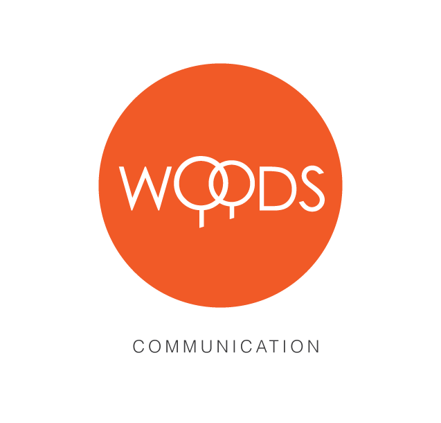
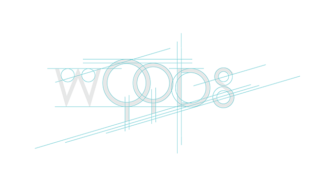

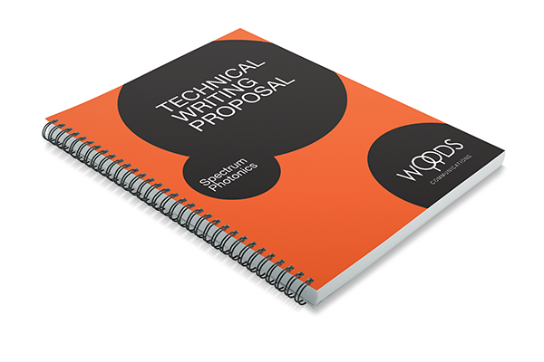
A contemporary, minimalist brand identity design for a technical & marketing writer that focuses on the technology segment. The client wanted a timeless, sophisticated look that incorporated a literal, yet subtle reference to the company name. Although the tree is a powerful metaphor for knowledge and growth, we resisted the temptation to render more realistic looking trees, and instead opted for a very stylized representation that integrates well with the letterforms. Woods Communications specializes in storytelling and the idea of circles seemed like a very natural and meaningful visual metaphor for "bringing a story to a close". The intersection of the circles that form the tree symbol represents bringing separate ideas together to become one. The type is a custom letterform based on Century Gothic. We chose orange as the primary color for the identity because orange is the color of social communication and optimism.